Pie charts vs bar charts explaining 2011 MLB attendance
- 11/22/11, "Charting 2011 Major League Baseball Attendance," by Jon Peltier
So I had to follow the link. It was an article in Atlantic Cities, 2011 Major League Baseball Regular Season: Attendance by Team, which stated that combined attendance at all Major League Baseball (MBL) games was fifth highest in history. The article was accompanied by a chart, not showing a time series of attendance by year, which you might expect after seeing the “fifth highest in history” statement. Instead, the chart compared the attendance of the MLB teams. And it compared the teams using an unexpected approach.
Pie Charts
Here’s the MLB attendance chart. It’s not the worst pie chart ever, but it has substantial deficiencies.

The choice of chart type was strange. When you think about a team’s attendance, you think of total numbers. Showing the teams together as a portion of the league total is unusual, and the actual numbers are obscured.
Comparison of the sizes of the wedges is not easy, especially with so many data points, but at least the data is sorted.
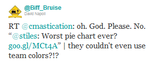
A big problem with this chart is identification of the data points. As the tweet indicated, the randomly assigned colors did not make use of team colors to aid in identification of the slices. There is no legend, but a legend is a poor way to label a chart, because you have to drag your eyes back and forth between chart and legend. In any case there are repeated colors, which would reduce the legend’s effectiveness.
This chart addresses the labeling problem by popping up a single label as the mouse passes over each pie slice. Unfortunately you have to wander around the pie to find your favorite team, then wander around again to see how other teams compared, then try to remember what you found before. This cognitive load overpowers the ability to interpret the data.
Since the screen capture didn’t capture the cursor, you don’t even know from this image which slice corresponds to the label. It’s the key lime pie slice in the lower right of the pie (it was black in the first view above).
Interactivity is a nice way to let a user find additional information that would otherwise clutter a graphic. However, forcing a user to interact with a chart simply to extract necessary information is a waste of the user’s energy and a waste of interactive effects....
Bar Charts
A bar chart lines up all the names in a neat list, and encodes attendance by the length of bars along a horizontal scale. Now without mousing around the pie, I can easily see how the teams rank. I can see that Philly had around 3.7 million attendees and Boston had just over 3 million.

Tweet Stumbleupon StumbleUpon
posted by susan at
11/28/2011 04:33:00 AM
![]()
![]()


0 Comments:
Post a Comment
<< Home